

Responsive!
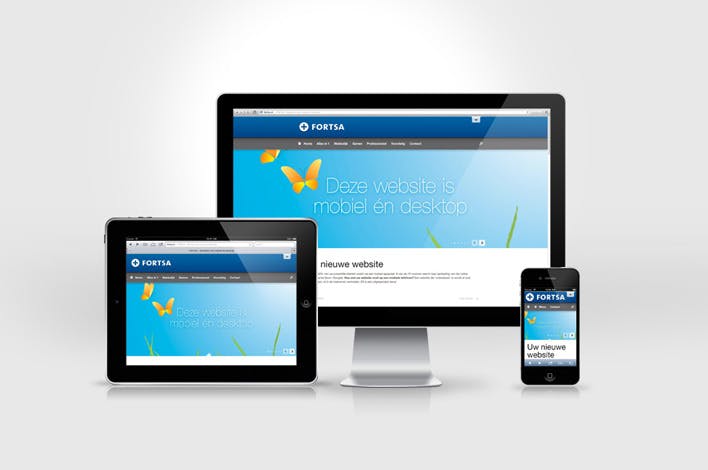
During the early years websites can only be accessed with a computer but today we can access a website on a mobile, tablet, tv, and sometimes even on a smartwatch. These devices have different screen sizes so modern websites should be developed in a way that they can adapt to any screen size. Here are some of the ways how you can design a responsive website.
why do we need responsiveness?
In this modern world, people are getting lazy so carrying a big laptop is a difficult task. That's why mobile phones account for 50% of global website traffic. What this means is that 50% of users across the globe are accessing websites through a smartphone. In India out of the total internet users 80% of people use smartphones. With this high number of internet users accessing the web through mobile, it is always advisable to build your website mobile-first before adapting to any other devices through this you can be sure that your website is responsive on every device.
Note
Responsiveness is not something like a button that you will press and it will make your website responsive. It's basically some steps that you need to follow so to make your website responsive.
The viewport meta tag
The viewport is the area of a website visible to the user. The viewport doesn't have a fixed size but it varies from one device to another big screens have big viewports compared to small screen devices.
The viewport tag is available in the HTML found in the <head> tag. It tells the browser how to render a webpage.
<head>
    <meta name="viewport" content="width=device-width, initial-scale=1">
</head>
width=device-width sets the width of the content to the width of the device initial-scale=1 is the initial zoom shown when someone visits the website.
Media query
A media query is a feature of CSS that tells the browser the modify the webpage if it fulfills the condition. Media queries help to achieve responsiveness by customizing web pages to support different devices. They target a device property such as screen resolution, orientation, and width then add styles to them to make it responsive.
The width media feature specifies the width of the viewport. It is one of the media queries you should use to achieve responsiveness This can be an exact number(for example 768px) or a range using min-width and max-width.
/*When viewport is atleast 700px */
@media screen and (min-width: 700px) {
  .element {

  }
}
/*When viewport is between 500 to 800px */
@media only screen and (min-width: 500px) and (max-width: 800px) {
  .element {

  }
}
Using Flexbox and Grid
Flexbox and Grid layouts are other ways of creating responsive layouts without using positioning or float.

Flexbox is a layout method in one dimension. With flexbox, you can arrange content in rows or columns.
.container{
   display: flex;
}
CSS grid is a two-dimensional layout method for laying out items in rows and columns. CSS grid is the most effective way of creating a responsive layout.
.container{
    display: grid;
}
Make the image flexible
There is no doubt that images play a vital role on web pages. Images are easy to understand compared to blocks of text. A poorly laid out image can mess up the layout of a website preventing visitors from returning. The code snippet below makes images responsive.
img{
  max-width: 100%;
}
Using Relative values
Units play a major role in creating responsive layouts. There are many units in CSS every unit display content differently. Units like pixel <px> is a fixed unit while em and other units give the freedom to adjust font size from their device settings.
Examples of relative units and their description:
remis relative to the font size of the root element.emis relative to the font size of the parent element.vhis relative to 1% of the viewport's height.vwis relative to 1% of the viewport's width.
So these are the steps or methods which you can use to increase the responsiveness of your website